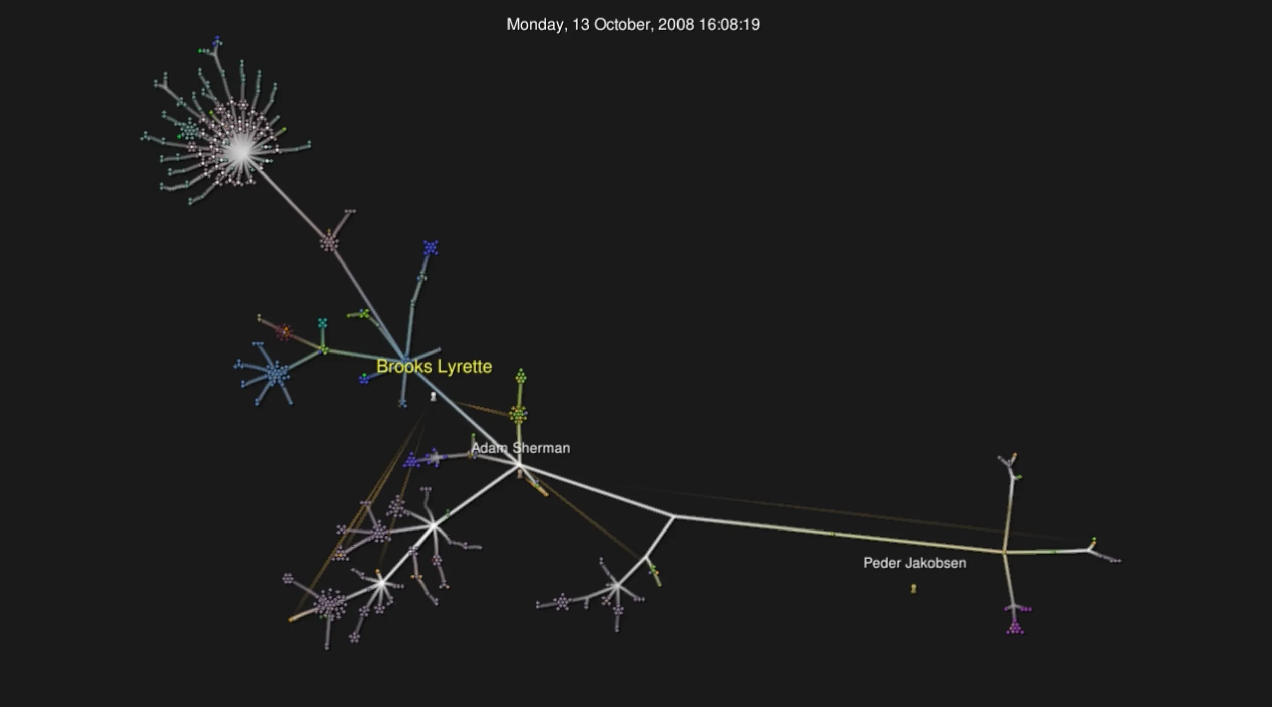
Who doesn’t love interesting data visualizations? One of the neatest looking ones is visualizing commits to a git repository. Gource is my go-to tool to create these types of visualizations.
Here is a step by step on how to generate a video on MacOS.
Setup
First, you’ll need to install gource and ffmpeg. I use brew as my package manager. Installing gource and ffmpeg is as simple as:
$ brew install ffmpeg
$ brew install gource
This might take a long time depending on what other packages you have installed.
Using Gource
Gource is very simple to use. Just type gource in the root of any git project.
There are also a ton of options you can enable and disable. I recommend setting a better resolution, disabling the bloom effect and hiding filenames. The bloom effect is horrible when you create a video. It gets very pixelated when the video is compressed.
You also might want to tweak seconds-per-day and auto-skip-seconds depending on how old the repo is.
Making a video
You can just pipe the output from gource into ffmpeg by doing:
$ gource -1280x720 -o - | ffmpeg -y -r 60 -f image2pipe -vcodec ppm -i - -vcodec libx264 -preset ultrafast -pix_fmt yuv420p -crf 1 -threads 0 -bf 0 <filename>.mp4Here is one of the main repositories I committed to from 2007 - 2016. I used these settings to highlight my name and make it go a bit faster.
$ gource --hide bloom,filenames,dirnames --follow-user "Brooks Lyrette" --file-idle-time 15 --seconds-per-day 0.075 --auto-skip-seconds 1 --highlight-users --stop-at-end -1280x720 Is it just me or is everything a bit more dramatic when you set it to a classical waltz?